yLinkButton
Description
The yLinkButton is a clickable element with different optical styles, used to indicate its different states. The yLinkButton can be used to trigger a user action and to redirect to other pages. For example:
Basic Structure
The basic structure of the yLinkButton shall be explained in the following. For the general structure of a yComponent please visit the YBase-components basic-structure.
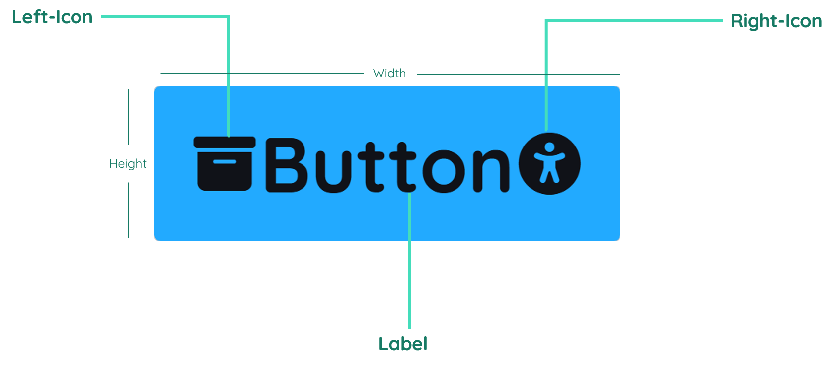
The yLinkButton as seen above contains a label and a icon.
Label
The label contains the text inside the button. It is normally in the center of the component, but can also be displayed on the right or left side. By changing the inner padding of the button, the label gets moved too.
Icon

The icon can be used to show an icon inside the yLinkButton - you can have a maximum of two icons. The icon can be before or after the text and if you want to have a yLinkButton with just an icon and no text, you have to delete the text inside the Label.
Properties
- Generic
- Style
- LinkButton
- Events
METAread more
The identifier of the component that is unique within a page.
The type of the component. For this component it is -link-button.
The custom name of the component. It serves for better identification of the component.
The custom version of the LinkButton-component. This can be used to ensure that all components work well together.
The CoreTheme, which will be apllied to the LinkButton. For further information on themes visit the themes page.
The subtheme subordinated to the previously specified CoreTheme, which will be apllied to the LinkButton. For further information on themes visit the themes page.
The group theme is a further variation of the subtheme which is specified especially for variations of a component inside the subtheme. For further information on themes visit the Theme-Manager page.
DISPLAYread more
This property specifies the display behavior of the component. This can be be set to:
- none
- block
- flex
- inline
This property specifies the type of positioning method used for the component. This can be be set to:
- static
- relative
- absolute
- sticky
- fixed
This property can toggle the visibility of the component. The two modes are completely hidden and fully shown.
SIZEread more
The minimum value for the width of the component. This can be set in:
- px
- pt
- em
- vw
- vh
- %
The minimum value for the height of the component. This can be set in:
- px
- pt
- em
- vw
- vh
- %
The value for the width of the component. This can be set in:
- px
- pt
- em
- vw
- vh
- %
- auto
The value for the height of the component. This can be set in:
- px
- pt
- em
- vw
- vh
- %
- auto
The maximum value for the width of the component. This can be set in:
- px
- pt
- em
- vw
- vh
- %
- none
The maximum value for the height of the component. This can be set in:
- px
- pt
- em
- vw
- vh
- %
- none
The flex property sets the length on flexible items. This sets the value in n-fold shares extrapolated to all other components with the flex display within the same container.
PLACEMENTread more
This property creates a space around the component, outside of the top border. This can be set in percent or pixels.
This property creates a space around the component, outside of the right border. This can be set in percent or pixels.
This property creates a space around the component, outside of the bottom border. This can be set in percent or pixels.
This property creates a space around the component, outside of the left border. This can be set in percent or pixels.
This property creates a space within the component, inside of the top border. This can be set in percent or pixels.
This property creates a space within the component, inside of the right border. This can be set in percent or pixels.
This property creates a space within the component, inside of the bottom border. This can be set in percent or pixels.
This property creates a space within the component, inside of the top border. This can be set in percent or pixels.
BACKGROUNDread more
The color of the background. This can be set as a color from a palette or a custom hex color.
BORDERread more
The color of the top border. This can be set as a color from a palette or a custom hex color.
The style of the top border. This can be be set to:
- solid
- dotted
- dashed
- none
The width of the top border. This can be set in percent or pixels.
The color of the right border. This can be set as a color from a palette or a custom hex color.
The style of the right border. This can be be set to:
- solid
- dotted
- dashed
- none
The width of the right border. This can be set in percent or pixels.
The color of the bottom border. This can be set as a color from a palette or a custom hex color.
The style of the bottom border. This can be be set to:
- solid
- dotted
- dashed
- none
The width of the bottom border. This can be set in percent or pixels.
The color of the left border. This can be set as a color from a palette or a custom hex color.
The style of the left border. This can be be set to:
- solid
- dotted
- dashed
- none
The width of the left border. This can be set in percent or pixels.
The radius of the corners of all the borders. This can be set in percent or pixels.
SHADOWread more
The shadow of the component. This is set by the 4 sub-properties x, y, blur and spread of the shadow-property, which can be further read about in the shadow-property section.
OPACITYread more
The opacity of all colored parts of the component. This value is set in percent.
LABELread more
The color of the label text. This can be set as a color from a palette or a custom hex color.
The font-family of the label text. This can be picked from a large list of provided fonts.
The font-weight of the label text. This can be set in a custom number, as example:
- 400 = normal(regular)
- 500 = medium
- 600 = semi bold
- 700 = bold
The font-style of the label text. This can be set to normal, italic or oblique.
The text-transformation of the label text. This can be set to:
- capitalize
- uppercase
- lowercase
- none
- full-width
The text-decoration of the label text. This can be set to:
- strikethrough
- underline
The font-size of the label text. This can be set in: -cm
- mm
- in
- px
- em
- ex
- ch
- rem
The font-align of the label text. This property moves the label text to the desired position, it can be set to left, center or right.
The actual written text in the label. There is no limit to the number of characters.
ICONread more
The position of the icon-element inside the LinkButton-component. This can be set to:
- iconLeft
- iconRight
- iconBoth
- none
The primary-color of the icon-element inside the LinkButton-component. This can be set as a color from a palette or a custom hex color.
The secondary-color of the icon-element inside the LinkButton-component. This can be set as a color from a palette or a custom hex color.
The size of the icon. This can be set in: -cm
- mm
- in
- px
The icon to be set as the left icon of the icon-element inside the LinkButton-component.
The icon to be set as the right icon of the icon-element inside the LinkButton-component.
STATEread more
This property can disable or enable the active-state of the LinkButton-component.
This property can disable or enable the disabled-state of the LinkButton-component.
TOOLTIPread more
The text of the tooltip, which is displayed when hovering over the LinkButton-component. If you do not insert anything, no tooltip appears.
MISCread more
This property can configure the LinkButton-component to cause an emit every click or to be used to set a variable true and false.
The sourceLink that will be used as a target reference.
LIFECYCLEread more
This specifies the function to be called, when the LinkButton is initialized.
CONTROLread more
If this property is true the LinkButton emits a command to create a new entity instance in the database on click. Clipboard
If this property is true the LinkButton emits a command to read an entity instance in the database on click.
If this property is true the LinkButton emits a command to update an entity instance in the database on click.
If this property is true the LinkButton emits a command to delete an entity instance in the database on click.
INPUTread more
The event that is triggered when clicking inside the input field.
Usage
In this section you will find a collection of application scenarios and examples that illustrate how to leverage the yLinkButton in ways that deviate from its standard behavior, as defined by yBase. This section aims to inspire and guide you through various possibilities, helping you to implement more complex or unique functionalities tailored to your specific needs. General properties that are universally applicable can be found in the yBase usage section.
Variations
- Elevated
- Flat
- Outlined
- Rounded
- Plain
Label
- Uppercase Label
Icon
- iconRight
- iconBoth
- iconOnly
Redirecting
The button component enables you to redirect to pages or external URLs each time it is clicked.
For instance, you could redirect to an official website to give further information about a topic your application covers.
How to:
- Navigate to Component inside the Detail Panel and unfold the group Misc.
- Choose a
Link-Targetof your liking by inserting the relative route of your page or an external url - for examplewww.google.comorlandingfor a yPage with this route.
Calling a Custom Javascript Function
The yLinkButton component enables you to execute a custom JavaScript function each time it is clicked, similar to the yButton.
For instance, you could set up a function that alerts "Attention, redirecting!", before redirecting.
How to:
- Follow the steps in Redirecting Example.
- Open the editor under Event, unfold Input and open
EvtClicked. - Associate a custom JavaScript function to the yLinkButton. This function will be invoked every time the button is clicked.
- Include the provided JavaScript snippet below to implement an alert function on the button.
Code example:
You can add the following JavaScript code snippet to your application to implement an alert function on the yLinkButton component.
With this function, each click alerts a message before redirecting.
This will only work, when redirecting inside your application and not directing to external urls.
// function onLink-button_7_EvtClicked (apiObject, component, eventData) {

alert("Attention, redirecting!");

// }
Interacting with Clipboard
You can use the yLinkButton to control Clipboards. The yeetClipboard functionality provides an effective method for managing table entries for example. For example, you can set up a mechanism to delete a table entry by a simple button click.
How to:
- Open the Detail Panel and proceed to the events tab and locate the Control section. Here, you will need to enable the
Commit-Deleteoption. This step empowers the yLinkButton component with the capability to perform this functionality. - Create a new Clipboard and enable the
Use Entitytoggle.
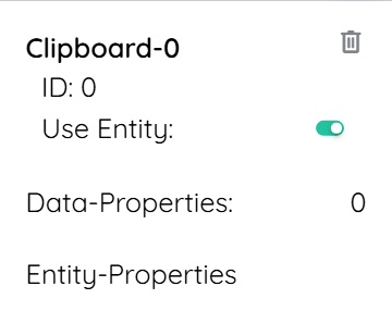
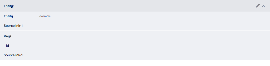
- You can then click on Entity-Properties and edit the
Entity. This Clipboard should be linked to the entity containing the table entry you wish to delete. This way you have to fill in the data, like in the picture below.
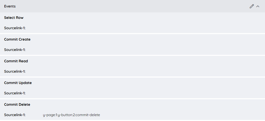
- Finally, go to the Events, edit it and select the yButton as SourceLink-1. Dont forget that the event has to be
commit-delete, which should look something like:y-page:1:y-button:2:commit-delete.
This will establish a button that, when clicked, will delete the specified entry from your table.
If you want to know more about this topic, visit the Clipboard.